


Photo by Lautaro Andreani on Unsplash
Replacing React Hooks with React Redux State Management Library Part 2
About the Application.


Part 1 of this series was about how the React library works, I covered the basics of React, from installation to working with the React library to React Hooks that are available to functional components.
This second part would be about the application we're going to be building with React(admittedly I'm halfway done building at the time of writing).
We'll be going through the application structure and how the application is supposed to function, we are also going to consume a REST API to enhance the functionality of the application.
Structure of our Currency App
The Currency App is structured:
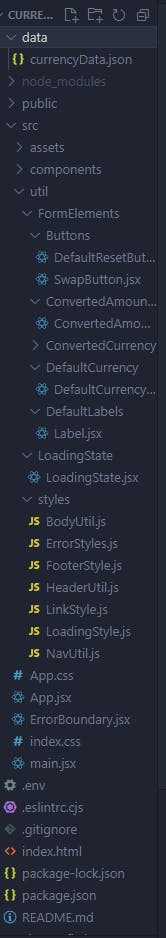
Now let's cover the most important parts:
data - This folder has the "CurrencyData.json" file which holds the in-memory data of two currencies, USD and NGN(United States Dollar and the Nigerian Naira).src - This is our source directory which holds all of our React components, our utilities folder and the styles folder that contains styled-components javascript files(a type of css-in-js solution to styling).components - The components folder as the name implies holds all of our components that make up the application, they are split up into several sub-folders that each hold a piece of the user interface, they are the Navigation, Header, Body and Footer.util - The util folder holds the "FormElements" folder which has all of the utilities that would make up the functionality of our app split up into micro-frontends, like our buttons, labels etc.ErrorBoundary - This file present in our util folder serves as our error handler which displays an error user interface if a critical part of our application fails..env - This stores the environment variable that would be used to gain access to the real currency data as the app is being built.
The list above covers the most important aspects of the application.
We are still a ways off from the app functioning correctly, we've mocked the functionality using our in-memory data and with the help of React hooks, we still have a lot to implement according to the README file I created for the project. But so far we have added 3D hover effects(which will be covered later) and we've also used React Icons to create the currencies logo on the homepage, Let get to understand how the app functions presently.
Understanding the App
The Currency Exchange App is a frontend project that on completion is going to make use of tools like:
ChartJs
Vite - (Build Tool)
React Library
Font Awesome
Framer Motion
React Router
Let's briefly discuss what each would be doing in our application.
ChartJS
This is a library that lets us turn data into meaningful charts and its going to give a visual representation of the currency we're going to compare.
We can use the ChartJS library to structure currency data into whatever data visualization we might need.

Vite
Our build tool we use to instantiate the project and start building with React. Vite is the tool we use to create a React application.

React
The JavaScript UI library we're going to be building the application with. We gave a brief overview of its features in the part 1 of this series.

Font Awesome
A JavaScript library that gives us access to performant icons we can use for our projects.

Framer Motion
This is a JavaScript motion library that can help animate and give fluidity to our components.
Framer Motion

React Router
The React Router library allows us to turn our single-page React application into a multipage application, we're going to use it to add more routable pages to our single-page application.

So now we've glossed over the tools we'll be using to build our Currency Exchange Application, now let's look at the present state of the application.
App Architecture
The application would adhere to the MVC(Model-View-Controller) pattern in building the app as our model or data would be received from an api and react would serve as our view while Redux would be incorporated to act as a controller to dispatch action objects to update the user interface.
Data
Currently, the app makes use of a CurrencyData.json file as its data.
[
    {
      "currency_pair": "USD_NGN",
      "exchange_rate": 789.503727
    }
]
We are going to use this currency pair to create basic logic that stands as a basis for our currency exchange application.
As the app is being built we do not want to make too many API calls and risk our IP address being blocked or rate limited so we'll settle for in-memory JSON data till we want to incorporate the Redux library.
ErrorBoundary
The ErrorBoundary in our utils folder will serve as the error fallback when there's an error in our application.
import React from "react"
import { backButton, errorContainerStyle } from "./util/styles/ErrorStyles"

class ErrorBoundary extends React.Component {
    constructor(props) {
      super(props)
      this.state = { hasError: false }
    }

    static getDerivedStateFromError(error) {
      return { hasError: true }
    }

    componentDidCatch(error, errorInfo) {
      console.log(error, errorInfo)
    }

    render() {

      if (this.state.hasError) {
        return (
          <div style={errorContainerStyle}>
            <h1>Unfortunately, something went wrong.</h1>
            <br/>
            <a style={backButton} href="/">Go Back</a>
          </div>
        )
      }
      return this.props.children
    }
  }

  export default ErrorBoundary
An ErrorBoundary Class Component is a component we use to create a fallback whenever an error occurs in our app, it is done by tapping into the lifecycle of our application with the getDerivedStateFromError and componentDidCatch lifecycle methods, when there's an error, the state variable object hasError changes from false to true and then the render function renders the UI based on the condition returning true instead of the usual children components when everything is running smoothly in the application.
If I change the App Component to throw an error we'll get:

Success! We have our error fallback!!
This UI is going to be displayed if there's an error with our application.
Let's discuss the styling:
Styles
Our App makes use of several styling strategies but the one that applies universally is our:
Index.css
Our index.css holds all the css that is globally available to the application(you can still apply styles globally elsewhere but its good practice to keep global styling to this file).
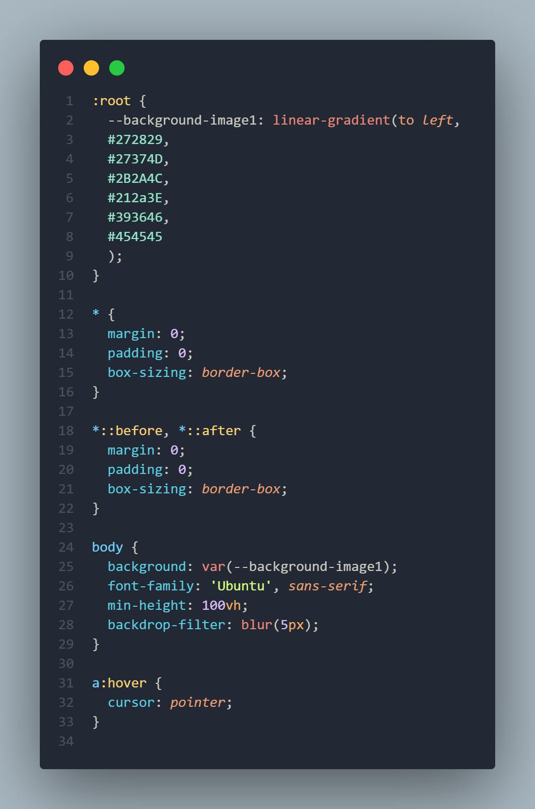
In our index.css above we're creating root variables for our background with the linear-gradient value and passing all the hex values(e.g #ffffff) for our colors. Next is to assign our app a font family and a backdrop filter to create the translucent effect in our application.
We then remove the default margins and paddings for all our elements including our pseudoelements.
Styled Components
React allows us the ability to style our components in-line using JavaScript objects, this means since we'll be writing Javascript within the React elements themselves we'd need to use double curly braces to write our styles.
function ReactInlineStyle(props) {
    return <h1 style={{display: "block", textAlign: "center" }}>Centered Text</h1>
}
We used this type of styling for our ErrorBoundary Component.
The styled component library allows us to create components which have styles scoped to the element they replace and also affect elements nested in them or others around them which the styles may affect.
You can read more about them with the links provided below:
In our app, they help to create our main UI:
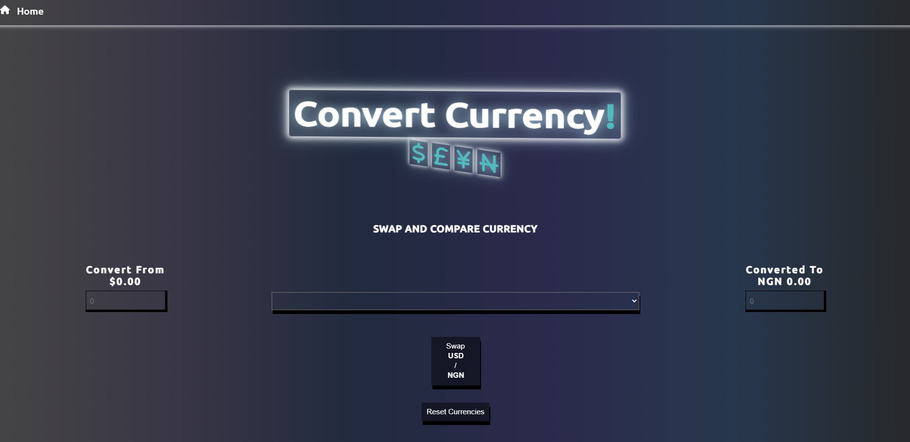
Super Cool!
All Styles can be found on:
Now that we've glossed over our styling, now let's get to my favorite part, the app logic.
Application Logic
The Currency Converter application has several functions used to control the 3D effects of our logo, along with the logic used to make JavaScript recognize the data input as currency, we'll start with the 3D effects of the logo.
Header Code
import { useState, useEffect, useCallback } from 'react'
import { FontAwesomeIcon } from '@fortawesome/react-fontawesome'
import { faNairaSign, faDollarSign, faPoundSign, faYenSign } from '@fortawesome/free-solid-svg-icons'

import {
    HeaderContainer,
    Heading,
    ExclamationMark,
    HeadingText,
    CurrencyFont,
    FontContainer
} from '../../util/styles/HeaderUtil'

function Header() {

    const [effect, setEffect] = useState(false)

    const runEffect = useCallback((e) => {
        console.log(`MOUSE MOVEMENT DETECTED`)
        setEffect(true)
        if (effect) {
            let xAxis = (window.innerWidth / 2 - e.pageX) / 15
            let yAxis = (window.innerHeight / 2 - e.pageY) / 15
            e.target.style.transform = `rotateX(${xAxis}deg) rotateY(${yAxis}deg)`
        }
    }, [effect])

    useEffect(() => {
        setEffect(true)

        return () => {
            setEffect(false)
        }
    }, [effect])


    return (
        <HeaderContainer onMouseMove={runEffect}>
            <Heading>
                <HeadingText>
                    Convert Currency
                <ExclamationMark>!</ExclamationMark>
                </HeadingText>
                <FontContainer>
                    <FontAwesomeIcon style={CurrencyFont} icon={faDollarSign} />
                    <FontAwesomeIcon style={CurrencyFont} icon={faPoundSign} />
                    <FontAwesomeIcon style={CurrencyFont} icon={faYenSign} />
                    <FontAwesomeIcon style={CurrencyFont} icon={faNairaSign} />
                </FontContainer>
            </Heading>
        </HeaderContainer>
    )
}

export default Header
We're importing React hooks useState, useEffect and useCallback in our Header component, we will use the useState to create a boolean to trigger our 3D effect when we detect a movement to the component on the screen with our onMouseMove event listener, this will run our effect handler function called runEffect where we create variables xAxis and yAxis to save the position in degrees that we want the logo to face depending on the mouse movement.
We also make use of a custom FontAwesomeIcon component that we can use to import icons into the header and finally select the currency type we want to import, this will be passed to the icon attribute so the component knows the currency icon to display. Our useEffect will only watch for changes in its dependency array to check the state of the variable and then return the negated state, that way the effect can start and stop on mouse move.

Time to move on to the body, this is where most of the app logic would be implemented. Lets review the code:
/* eslint-disable react/prop-types */
import DefaultResetButton from
'../../util/FormElements/Buttons/DefaultResetButton'
import SwapButton from
'../../util/FormElements/Buttons/SwapButton'
import ConvertedAmountLabel from
'../../util/FormElements/ConvertedAmountLabel/ConvertedAmountLabel'
import DefaultCurrency from
'../../util/FormElements/DefaultCurrency/DefaultCurrency'
import DefaultLabel from
'../../util/FormElements/DefaultLabels/Label'
import ConvertedCurrency from
'../../util/FormElements/ConvertedCurrency/ConvertedCurrency'
import {
FormElement,
Legend,
FirstFieldSet,
SecondFieldSet,
ThirdFieldSet,
Select,
} from '../../util/styles/BodyUtil'
function Body({currency,
swapCurrencies,
changeCurrencyHandler,
convertedNumber,
defaultNumber}) {
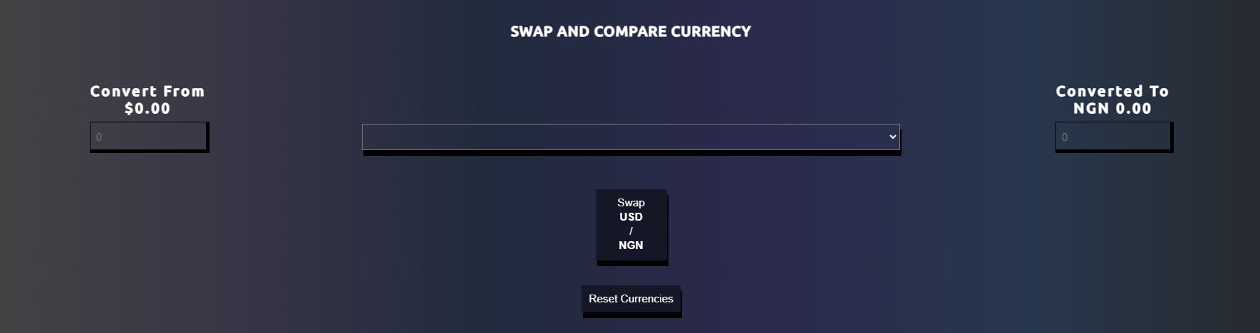
return (
<FormElement>
<Legend>Swap and Compare Currency</Legend>
<FirstFieldSet>
<DefaultLabel defaultNumber={defaultNumber} currency={currency} />
<DefaultCurrency currency={currency} changeCurrencyHandler={changeCurrencyHandler} />
</FirstFieldSet>
<SecondFieldSet>
<Select>
<option>
</option>
</Select>
<SwapButton currency={currency} swapCurrencies={swapCurrencies} />
<DefaultResetButton />
</SecondFieldSet>
<ThirdFieldSet>
<ConvertedAmountLabel convertedNumber={convertedNumber} currency={currency} />
<ConvertedCurrency currency={currency} changeCurrencyHandler={changeCurrencyHandler} />
</ThirdFieldSet>
</FormElement>
)
}
export default Body
A reminder, the app is still being built, so I've left the option element with no select element as this would hold the different currencies that would be gotten back from the REST API I'll be integrating.
Already, the Body component is accepting 5 props(properties), they have been destructured in the argument block of our function(props are objects that store react attributes so we can use destructuring to get the data in them). I'll discuss about them later.
The Body component is created to return a form element which I've styled with styled components and then split up each input element into its own custom styled component
Each section of the form is split into 3 using 3 fieldset elements that are also customized with styled components.
Functionally, the important bits that relate to logic are the:
DefaultLabel component (nested in FirstFieldSet)DefaultCurrency component (nested in FirstFieldSet)Select component (nested in SecondFieldSet)SwapButton component (nested in SecondFieldSet)DefaultResetButton component (nested in SecondFieldSet)ConvertedAmountLabel (nested in ThirdFieldSet)ConvertedCurrency (nested in ThirdFieldSet)
The above components are custom elements created using our styled components.
DefaultLabel
import {
    ConvertTitle, Label,
} from '../../styles/BodyUtil'

const DefaultLabel = ({
                       currency,
                       defaultNumber}) => {
    return (
        <Label htmlFor="defaultTypeAmount">
                    <ConvertTitle>Convert from</ConvertTitle>
                    {currency.convertedTypeAmount ? defaultNumber.toLocaleString("en-US",{
                    style: "currency",
                    currency: currency.defaultType
                }) : currency.defaultTypeAmount.toLocaleString("en-US",{
                    style: "currency",
                    currency: currency.defaultType
                })}
                </Label>
    )
}

export default DefaultLabel
The DefaultLabel component accepts 2 arguments, currency and defaultNumber.
The two props are used to display the currencies by checking if the currency.convertedTypeAmount exists, this is done by using a ternary operator.
We check if the convertedTypeAmount exists to show either the default currency or the currency we want to swap. The .toLocaleString() is then used to display the type of currency by passing in a second parameter object with the currency key set to currency.defaultType.
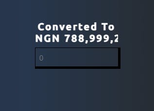
The convertedAmountLabel does the same but the logic checks against the currency.defaultTypeAmount
import {
    ConvertTitle, ConvertedLabel
} from '../../styles/BodyUtil'

const ConvertedAmountLabel = ({currency, convertedNumber}) => {
    return (
        <ConvertedLabel htmlFor="convertedTypeAmount">
                    <ConvertTitle>Converted to</ConvertTitle>
                    {currency.defaultTypeAmount ? convertedNumber.toLocaleString("en-US",{
                        style: "currency",
                        currency: currency.convertedType
                    }) :
                    currency.convertedTypeAmount.toLocaleString("en-US",{
                        style: "currency",
                        currency: currency.convertedType
                    })}
        </ConvertedLabel>
    )
}

export default ConvertedAmountLabel
The Select component doesn't hold logic at present but only renders styles dictated by our Select styled component.
DefaultCurrency
import {
    CurrencyInput
} from '../../styles/BodyUtil';

const DefaultCurrency = ({currency, changeCurrencyHandler}) => {
    return (
        <CurrencyInput type="number" name="defaultTypeAmount" id="defaultTypeAmount"
                value={currency.defaultTypeAmount || ""}
                placeholder="0"
                onChange={changeCurrencyHandler}
                min={0}
                max={999999}
                step={0.5}
                />
    )
}

export default DefaultCurrency;
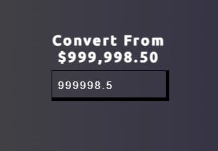
The DefaultCurrency component is an input element of type number which accepts two parameters, currency and changeCurrencyHandler, the currency is used to show the default currency from the currency.defaultTypeAmount state object which holds the currency value, we also put a 0 as the placeholder for the currency, the onChange handler is passed a function called changeCurrencyHandler and then we define attributes we want the input element to have like a min for minimum amount, max for maximum amount and then step for the amount of increments we want to be taking when clicking the increment arrow.
SwapButton
import {
    SwapCurrencyButton,
    SwapCurrencyText
} from '../../styles/BodyUtil'

const SwapButton = ({currency, swapCurrencies}) => {
    return (
    <SwapCurrencyButton onClick={swapCurrencies}>
    Swap <SwapCurrencyText>{currency.defaultType}</SwapCurrencyText>/<SwapCurrencyText>{currency.convertedType}</SwapCurrencyText>
    </SwapCurrencyButton>
)
    }

export default SwapButton
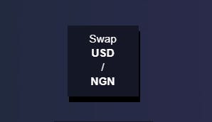
The SwapButton component accepts two parameters, currency and swapCurrencies, these are used to keep track of which currencies are currently being observed and then using the swapCurrencies function we can then swap the defaultCurrency state object with the convertedCurrency state object.
ConvertedCurrency
import {
    CurrencyInput,
} from '../../styles/BodyUtil'

const ConvertedCurrency = ({currency, changeCurrencyHandler}) => {
    return (
        <CurrencyInput type="number" name="convertedTypeAmount" id="convertedTypeAmount"
        value={currency.convertedTypeAmount || ""}
        placeholder="0"
        onChange={changeCurrencyHandler}
        min={0}
        max={999999}
        step={0.5}
        />
    )
}

export default ConvertedCurrency
Does the same thing as the DefaultCurrency component but for the converted currency, it also returns an input element of type number and also uses the currency prop passed to it to display the converted currency type, it uses the same changeCurrencyHandler to control how the input changes.
DefaultResetButton
import {
    ResetButton,
} from '../../styles/BodyUtil';

const DefaultResetButton = () => {
    return (
        <ResetButton>
        Reset Currencies
        </ResetButton>
    )
}

export default DefaultResetButton;

Presently, the DefaultResetButton component returns a styled component that would reset the swapped currencies to their default values. We would include this functionality later.
Overall view of the form:
This was a lot to cover, we'll leave the main logic and refactoring for part 3.